Home Page
Full Height Banner Style

Home page: Note the banner slider photos that extends to full height of the browser window. Interestingly, these photos are not hot links that link to other pages which is unusual for home page sliders.

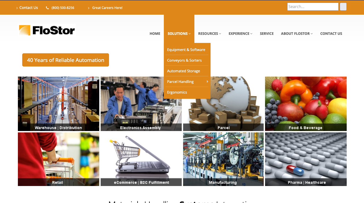
Submenu Style
Note the prominence of the “Contact Us” button which is bigger than any other text in the header.
Also, I like the spacious elegance of the drop down menu. If we were to emulate this style we would probably have to restructure how the organization of the Flostor site.

Currently Flostor’s drop downs are more narrow with smaller font size and the sub-sub-menus can only be seen if the user clicks on the sub-menu item with the right facing arrow. In the Daifuku sub-menu the user can see all the sub-sub-menu items all at once without the user having to click on anything.
Mobile Header Layout
The hamburger icon on the Flostor site needs to be moved up on the same level as the logo.
The FloStor logo has a white background where the webpage has a off-white background. We need to either change the webpage color to white or change the logo background color to off-white.
I would suggest that we put the 40 Years of Reliable Automation elsewhere. One could argue that having this text as a button requires the user to click it which they probably won’t.
Instead of a button perhaps just new section below the banner with the title “40 Years of Reliable Automation” and the associated copy below.

